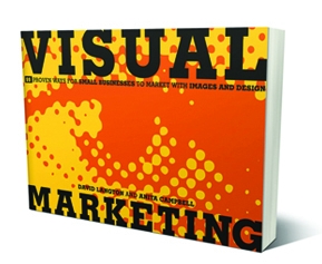
 We have selected 8 great visual marketing ideas for your business taken from the book Visual Marketing, by David Langton and Anita Campbell. David Langton is a visual communication designer, blogger, and author of visual design. Anitca Campbell is the CEO and founder of Small Business Trends, http://smallbiztrends.com.
7. How Many Ways Can You Destroy Your Printer? Going Viral with a Youtube Video Contest That Plays upon Customer Frustrations
Takeaway Tip
Contests, especially ones with user-submitted videos, can go viral if the subject matter is interesting enough. It’s not the number of entries–but how well the contest “speaks” to your target audience. Focusing on user-generated videos expressing frustrations that most people have experienced and that lend themselves to funny interpretation is a way to engage not only the contestants but the broader target audience of the contest’s product sponsor.
22. A Reflection of Style: Incorporating Your Business Style into Your Logo
Takeaway Tip
There are plenty of impersonal logos out there–you need only look to the vast majority of corporate logos. As a small business you can afford to let your logo reflect your unique business style–especially when the logo incorporates the business owner’s name. Think about whom your targeted audience consists of and play to them; don’t go wider. For instance, if your target audience is predominantly female, then go for a logo with feminine touches and in feminine colors. Trying to sty with a neutral look and feel may make it only more difficult to appeal to your core audience.
29. Traversing from Print to Mobile: Creating a Mobile App Version of Print for Customers with a Foot in the Mobile World
Takeaway Tip
The state of transmitting and consuming information is changing with the explosive growth of technology. And it’s not just transitioning online–we’re already in the mobile age. Convert what you are doing today in print to mobile devices. Create a mobile app that mirrors the print version but is attuned to and takes advantage of the unique attributes of mobile media to bridge the divide between old-school print and new school mobile.
50. Jump-Starting a New Package Design: Creating Quality Packaging Can Lead to Getting Carried by More Retailers
Takeaway Tip
Key to effective packaging is knowing your target audience well and designing a style of packaging that will appeal to the audience. Attractive packaging that suggests a quality product inside can also entice key retailers to carry the product.
59. Get Me a Doctor, STAT: Using a Witty or Humorous T-Shirt to Interject Fun into How People Perceive Your Business
Takeaway Tip
If you portray what you do as dry and boring, you won’t draw in clients or new hires. Create a humorous or witty T-shirt to interject some fun and lighten up how you portray your business. T-shirts are a form of self-expression, and when people wear yours, they will feel infused with the light feeling you are trying to convey.
82. All That Jazz, Funk, Blues, Pop, and Hip-Hop: Making Modifications in Your Imagery Can Appeal to a Younger Audience
Takeaway Tip
Not attracting younger audiences as your offering matures? Try branding modifications in the form of font sizes, bright colors, and imagery. The size of the words on a collateral are important in signaling the intention of your message to key audiences. And different images can make your offering appear up-to-date (versus stodgy) to appeal to younger demographics.
87. All for One and One for All: Repurposing Marketing Collateral on a Very Low Budget
Takeaway Tip
When you have a very small budget and can afford only one design piece but have to use it in different ways to promote different events, products, or services, you’d better put on your creative cap. Using a marker to cross out a name on a poster may not always be a good solution, but consider that a metaphor for finding low-cost ways to repurpose a single design to fit multiple situations, perhaps by dropping in different names or images using a computer graphics program. Necessity truly is the mother of invention.
91. An Industrial Business Bucks the Trend: Expressing Quality Through Color and Design Becomes a Competitive Advantage
Takeaway Tip
If your industry is “industrial” and isn’t big on pleasing design, that’s all the more reason for your company to have an eye-catching logo and color-infused print collateral. They become a competitive advantage. Don’t stick with the status quo if you want to gain market share.
If you would like to read more in-depth about these ideas, find the book on Amazon.com.


